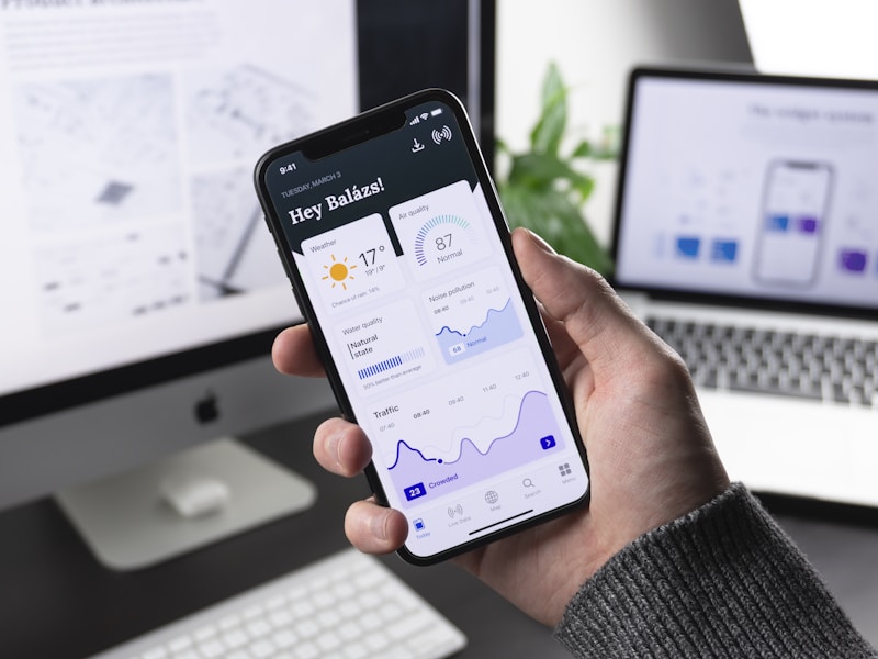
Mobile-First Responsive Design: Best Practices for 2025
Master mobile-first responsive design principles to create web applications that provide excellent experiences across all devices and screen sizes.
CreativeBrains is a digital innovation company that transforms ideas into reality. We combine AI technology with human creativity to design exceptional brands, intelligent products, and transformative digital experiences for startups and enterprises.


Master mobile-first responsive design principles to create web applications that provide excellent experiences across all devices and screen sizes.
Learn how to optimize web application performance using Core Web Vitals metrics to improve user experience and search engine rankings.
Ensure your web applications are accessible to all users by following WCAG guidelines and implementing inclusive design practices.
Explore how headless CMS solutions are enabling developers to create flexible content architectures that work across multiple platforms and channels.
Learn comprehensive testing strategies including unit tests, integration tests, and end-to-end testing to ensure web application quality and reliability.
Master database design principles to create efficient, scalable database schemas that support modern web application requirements and performance needs.